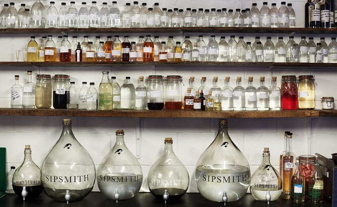
A while back, I had the pleasure of attending a tour of the Sipsmith Distillery in West London just around the corner from our studio. The evening was a beautifully curated journey through the history and science of distilling and how the founders of Sipsmith came to launch the first copper pot distillery in London for over 200 years.
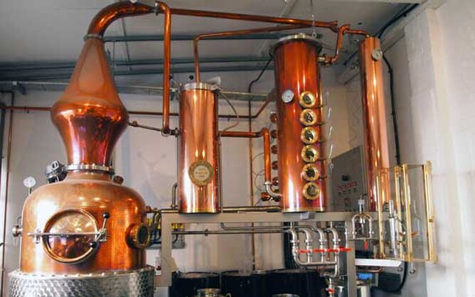
Needless to say, the gins and vodkas that were available to taste were delicious and probably all the more so for being in the presence of the three copper stills known as Prudence, Constance and Patience.
However, there was one thing in particular that caught my attention because it provides an analogy for what I believe is an essential part of a good design process - making sure things are not too easy.
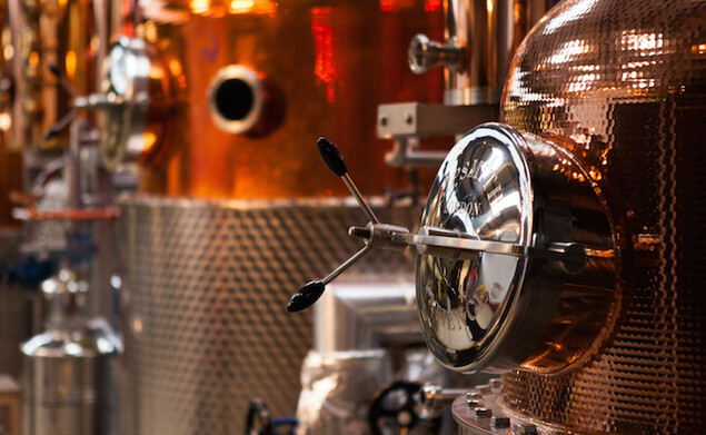
Our tour guide for the evening explained that everything about Prudence is designed to make the journey of the alcohol as difficult as possible. Prudence is handcrafted from copper using a bespoke design that combines a pot, carter head and column still which means that the clever team at Sipsmith can create incredibly pure vodka.
The distinctive shape of the pot and carter head creates a path that tends to condense the alcohol vapour so that it runs back down the inside of the copper walls. In this process impurities are removed.
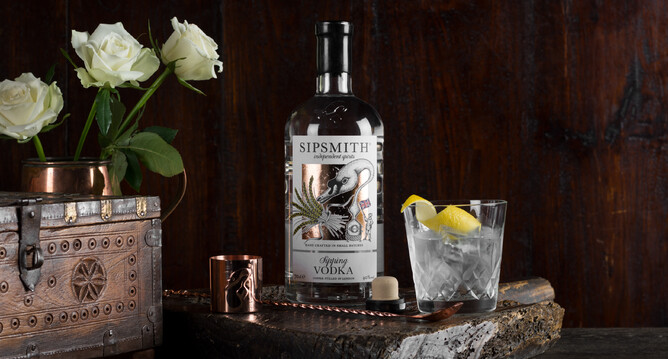
The alcohol that does make it up to the swan neck shaped tube (that gave rise to Sipsmith's label design) then has to journey through the column still.
Column stills are made up of a cylinder with a number of plates inside that are perforated with holes. You can see the six round viewing windows between the five plates in Prudence's column still in the image above. Once again, the journey of the alcohol is challenged so that only the purist vapour makes it to the outlet. The liquid in the still is repeatedly heated until it evaporates and manages to progressively climb higher in the column. Impurities are left behind to sink to the bottom.
Sometimes products are brought into the world that have followed the easiest, cheapest route to market. The design is based on whimsical decisions made in response to what the development team thinks is right. These products rarely delight their users and often require an element of perseverance to interact with. Think of a device with a battery compartment that is fiendishly hard to open or a website that is a pain to navigate.
By contrast a process that results in something that people genuinely want to use and are therefore more likely to buy, recommend and buy again needs to have involved numerous moments where design decisions are distilled through exposure to real people.
Not everyone has the appetite to design in this way. It is a more lengthy and possibly more expensive development process. But the result is a product that has been truly crafted that you can be proud of and you know is going to have a greater intrinsic value. A product that has left behind the impurities of poor usability, wrong material selection or functional defects.


